In this Issue:
Recent LibGuides Update
- mSite Builder Is Here!
- Public Discussion Boards
(CMS Only) - Account Invitations
- Create Floating Boxes
- ... and more!
5 Tips & Tricks for Maximizing your LibGuides for Mobile
LibGuides v2 is designed to be mobile-first. This means that your LibGuides will display beautifully on tablets and smartphones, right out of the box.
But, there are things that you can do so that content within the box is maximized for mobile users.
Introducing our 5 tips for maximizing your LibGuides for mobile devices.
With these tips, you'll have mobile-users mobbing your Guides in no time!
1. Using Images for Mobile Devices - Do's & Don'ts (V2)
Your LibGuides are mobile-friendly out of the box. However, images you upload might not be. These Do's and Don'ts will ensure that your LibGuides load quickly and beautifully on all devices.
Do Resize Images before Uploading
According to Smashing Magazine, mobile users expect webpages to load within 4 seconds. Also, most Mobile Networks are considerably slower than their broadband counterparts, so an image loads much slower on your 4G/3G smartphone than on a wifi/wired connection.
The simplest and most effective tip to ensure fast load times is to resize your images before uploading them to your LibGuide, especially if you are only going to use the image in a guide.
Changing the image size after you upload it does not affect the file size download. This means that large image files will take a long time to download on a mobile device.
Don't Shrink Large Images In LibGuides

Example:
If you upload an image that is 3000px by 3000px (2.5MB file size) and resize it inside your LibGuides to be 100px by 100px...the user still downloads all 3000px and all 2.5MB.
Most 4G Mobile Networks average .76 MB/second download speeds.
3G/4G Performance Map, PC World
It could take 3.28 seconds to download one image.
How do I resize images?
Here are some of our favorite tools for resizing images before uploading them to LibGuides:
|
Free |
$$$ |
|
Do I have to resize all images before I upload them to my LibGuide?
Nope, that would be just cray-cray. We only suggest resizing images if the original image and your desired display are drastically different. If you want the image to be between 10-15% smaller on your LibGuide, use the built-in image sizing options.
Do Compress Larger Images
Sometimes, a LibGuide needs a large image. Large images are visually compelling. But just because you have a large images doesn't mean you're dooming your mobile users to long download times.
Compressing an image before you upload it to your LibGuide removes extra kilobytes that you don't need. Shaving a few extra bytes off your large images can impact download speeds on mobile devices.
There are lots of image compression tools available, just Google it!
Do Use Font Awesome Icons!
If you want to use a lot of images in one guide, but you're worried about Mobile download speeds, try Font Awesome instead! Font Awesome gives you the flexibility of images, but has the same file size as text. Win-win!
What's Font Awesome?
Font Awesome is a free suite of 479 scalable vector icons that are easily customizable using basic HTML. Change the size, color, add a border, anything at all – using some really basic inline HTML.
Why Should I Use It?
The Font Awesome library is fully incorporated into LibGuides v2! So you only need to call the icons using their CSS classes. Use Font Awesome icons to:
- Add images to your guides
- Customize default display options - this bulleted list is using customized Font Awesome icons!
- Integrate Font Awesome social media icons in your template or header/footer.
What's the HTML Structure?
Bookmark These Links:
- Using Font Awesome Icons in LibGuides v2Complete list of Font Awesome Icons.
- Font Awesome CSS ExamplesExamples of ways you can modify the Font Awesome icons using simple CSS. Create spinning icons, add borders, rotate icons, and more!
2. When To Use Tables
In ye olden days of Internet-yore, webpages were designed using tables. That's right....tables. If you don't believe us, here's an example straight out of 1995.
If you're still using tables to layout content in LibGuides, you don't have to! Tables are best used for displaying tabular content, or content that naturally belongs in a grid.
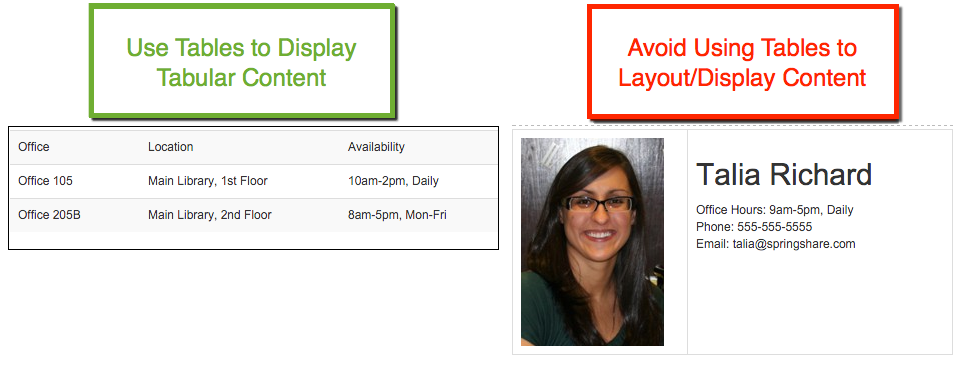
Tips for Aligning Content Without Using Tables:
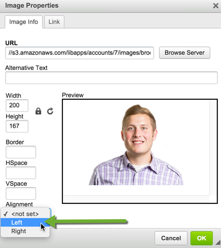
- Images- If you want an image to float next to text, don't use tables! Use the left / right alignment in the image properties menu.
- Creating multiple 'columns' to display content - Try using DIVs to float content, or even better - create Bootstrap rows right inside your Rich Text Editor (click Source to access the HTML editor).
3. How LibGuides Boxes Display On Mobile Devices (v2)
Have you ever looked at your LibGuide on a mobile device? If not, you don't have to fire-up your smartphone... simply resize this browser window and you'll get a good idea of how your LibGuide looks on a mobile-sized screen.
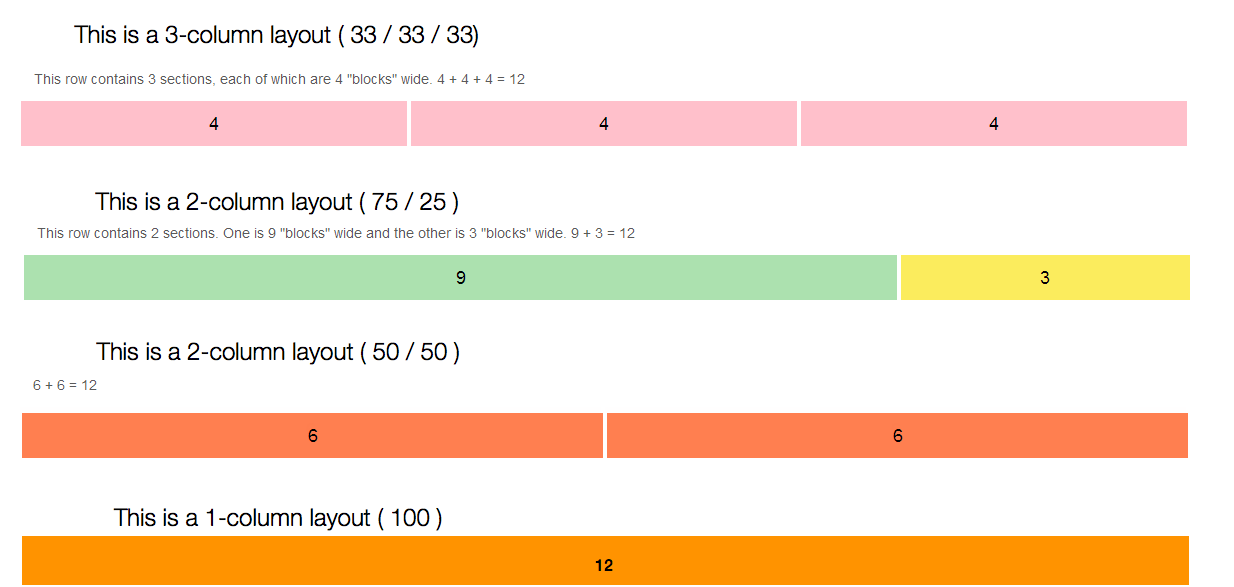
LibGuides v2 is built on the Bootstrap framework, which is designed to be responsive and mobile-first. When you're building a LibGuide, think of adding each box to a row.
- Each column within that row has a width value between 3-12 where 12 would span the box across the entire width of the guide.
- - If you're wondering why we don't have width values of 1 or 2, that's because a column with a width value of 1 would be too small to actually add content to it!
- Each row must have a total width equaling 12.
Having flexible, not fixed (i.e. pixel) widths for each LibGuides columns allows the columns to reorder and stack depending on the device size.
How does this translate to LibGuides columns?
How do LibGuides boxes reorder on mobile devices?
Tabbed Layout:
No matter the column layout, all boxes in the far-left column will reorder and display at the top of your mobile-LibGuide. Then center-column boxes will display, and then far right column boxes.
Front-load your most important content in the left column.
These boxes will display first on mobile-devices.
Side-Nav Layout:
1. Side-Nav displays first,
2. Boxes under side-nav,
3. Center boxes last.

4. Using Side-Nav Layout to Optimize Mobile Navigation (v2)
If mobile-responsiveness and design is your number one priority, then we suggest using the side-navigation style for all your LibGuides.
Why?
- Responsively-Designed - The side-nav automatically resizes and expands to fill the width of the screen on smaller screen sizes. Top tabs do not resize but reorganize and stack so that all are visible on a small screen.
- - Check out the video above!
- Better for Touching - Tabbed navigation can get small on smartphones, making it more difficult to 'touch' on touch screen devices. Side-nav fills the entire width of the screen, making it easy to select with your fingers.
Locking Down Side-Nav System-Wide (Admins Only)
You can lock down your navigation style system-wide so authors can only use the template you selected.
Bonus: If you're using LibGuides CMS, lock-down specific layouts for each CMS group.
- Orange Command Bar: Navigate to Admin > Look & Feel
- Page Layout > Guide
- Guide Pages Layout > Select Side-Nav Layout

5. Build Mobile-Friendly Pocket Guides
There's no limit to the number of guides you can build, so why not condense some of your larger, designed for Desktop-style LibGuides into Pocket Guides? Pocket guides are specifically designed for use on smart phones, so they'll contain just your best-best, mobile-optimized resources.
Tips for Building Pocket Guides
- Organize Them...Together - Using LibGuides CMS Groups, create a group called 'Pocket Guides' and store all your bite-sized guides there!
- Use Side-Nav - These guides are designed to be used on small or touch screen devices, so choose the Side-Navigation Layout.
- Go Light ... on the resources! Since these are designed to be used on tablets and smartphones, highlight only your best-bet resources.
- Less...is Less - Pocket guides should only have 2-3 pages, tops.
- Link to your Fuller Guide - Don't forget to link to your complete LibGuide for in-depth info.
- Reuse Content - Since you're building pocket-sized versions of larger LibGuides, reuse boxes and assets in your Pocket Guide. Building a pocket guide should take no time at all!
- Bite-sized URLs - Use super-short friendly URLs for easy typing on tiny keyboards.
- Link to Mobile-Content - Some databases, perhaps even your catalog, have mobile-specific URLs. Avoid linking to content that isn't mobile-friendly.